
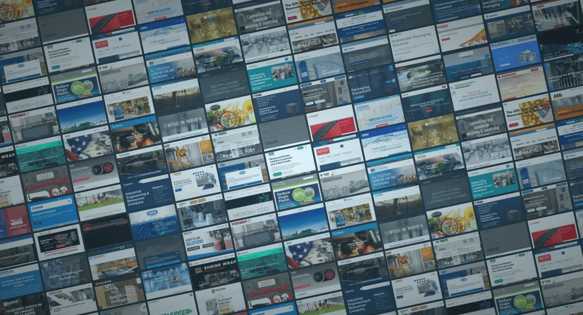
I spent January 2026 reviewing 159 packaging machinery websites. Here are the 9 biggest mistakes I found and how to fix each one. Methodology notes at the end.
1. Company-first framing
Your website has one page called "About Us." Everything else should be about them.
(Credit to Phil Buckley for that line.)
Most of these sites led with origin stories, anniversary banners, and executive headshots. Buyers don't care about your 50-year history. They care about solving their problem, building an internal business case, and figuring out if you're the right fit.
The fix: Rewrite your hero copy around buyer problems and outcomes. Reorder homepage sections around needs, not company chronology. Replace "we" with "you."
2. Cluttered flyout navigation
Multi-level flyout menus with tiny links, three or four layers deep, 20-30 options. These things were supposed to die with Dreamweaver.
When an engineering-minded team builds navigation, they tend to dump every product SKU into nested menus and let the visitor sort it out. That's decision overload, and it kills momentum.
The fix: Grouped, scannable mega menus. Reduce depth, prioritize your top paths, and make it obvious where each click leads. IBM's current navigation is a good reference. Six clean options, zero guesswork.
3. Visual chaos
Different fonts, different colors, stock photography next to AI-generated images next to actual product photos. Unclear what's clickable. Card elements with mismatched sizes and descriptions.
Inconsistency signals risk and immaturity. That's the opposite of what a buyer evaluating a $500K machine purchase wants to see.
The fix: Set brand standards and apply a tight, repeatable visual system. Standardize typography, unify your imagery, and cut the excess styles. Sealed Air's homepage card layout is a strong example: uniform sizing, consistent photography, clear CTAs.
4. Poor contrast
Text over untinted hero videos and busy background images. White type on light backgrounds. Small fonts that are hard to read, especially for the decision-makers with purchasing power, who tend to skew older.
If people can't read it, they can't act on it.
The fix: Use tinted overlays or darken your video backgrounds. Increase font size and weight. Make sure your type scales are readable on any device.
5. Confusing forms
10-12 field forms with multi-column layouts. These are the money buttons on your site, and too many companies are quietly killing leads with form bloat.
There's always tension between marketing wanting volume and sales wanting qualification, but there are better ways to handle that than front-loading a dozen required fields.
The fix: Cut to 3-5 fields. Vertically align. One column. Clear next step. You can always ask follow-up questions later. I wrote a full breakdown here: 10 best practices for B2B manufacturing lead forms.
6. No humans, only machines
Sterile, faceless websites that are nothing but machine catalogs. No team photos, no personality, no indication that real people work there.
In the age of AI and robotics, showing the humans behind your machines matters more than ever. Faceless brands lose trust and talent.
The fix: Add real photos of your team from trade shows, the shop floor, company events, recruiting. Ditch the stock photos and AI slop. Crutchfield is the gold standard here: every page features real advisors with actual bios and personality.
7. Clichéd phrasing
"Leading provider." "Global leader." "Innovative solutions." "Top quality." "Combined experience of 796 years."
After reviewing 159 sites in a couple of weeks, these phrases blur together until you can't tell one company from the next. If you can remove your headline and bolt it onto a competitor's site without anyone noticing, it's not doing its job.
The fix: Say things only your company can say. Be specific about who you're addressing and what problem you're solving. Rewrite headlines with a human voice.
8. Country flags for language switching
If you've got a localized, multi-language website: stop using flags to represent languages.
Canadians don't want to click a U.S. flag to switch to English. People in England speak English. Australians speak English. Spanish is spoken all over the world. Languages aren't countries.
The fix: Use text labels. Country, region, and language, clearly labeled. "United States – English," "Canada – Français (French)," etc. No flags needed.
9. Lack of legal compliance
GDPR, cookie consent, accessibility requirements, California-specific regulations, Canadian bilingual requirements, whistleblower laws in the EU. The global sites with legal teams tend to have this buttoned up. The smaller ones often don't.
There are attorneys out there actively looking for non-compliant sites to file quick-hit lawsuits. It happens.
The fix: Talk to your legal department. Implement a consent management platform (I tie these into Google Tag Manager with consent mode). Audit your trackers and document your compliance.
Methodology
I compiled the source list from PMMI ProSource, LinkedIn Sales Navigator, and Apollo. I excluded ProMach brands due to prior work.
For each site, I spent a couple minutes doing a quick video review, recording my screen and narrating observations. I then collated notes and grades in a Notion database. The full research was conducted in January 2026.
This was a quick-glimpse audit. No mobile testing, no performance testing. The goal was to identify patterns that create sales friction and hiring drag across the industry, not to critique design trends.
If you're looking to fix these issues, see my manufacturing website design services. For search visibility, check out SEO for manufacturers.